The Dashboard is now called Streams, and it got a full redesign on October 29, 2026. A card for a live or stopped stream has two action buttons instead of five. One pill shows what the stream is doing. You can pin the streams you use most to the sidebar. Dark mode is darker and flatter, light mode lost its purple tint, and stream settings open in a window over the page.
We measured the numbers below in the app's code, before and after the release, and in the rendered page.
What's new on the Streams page
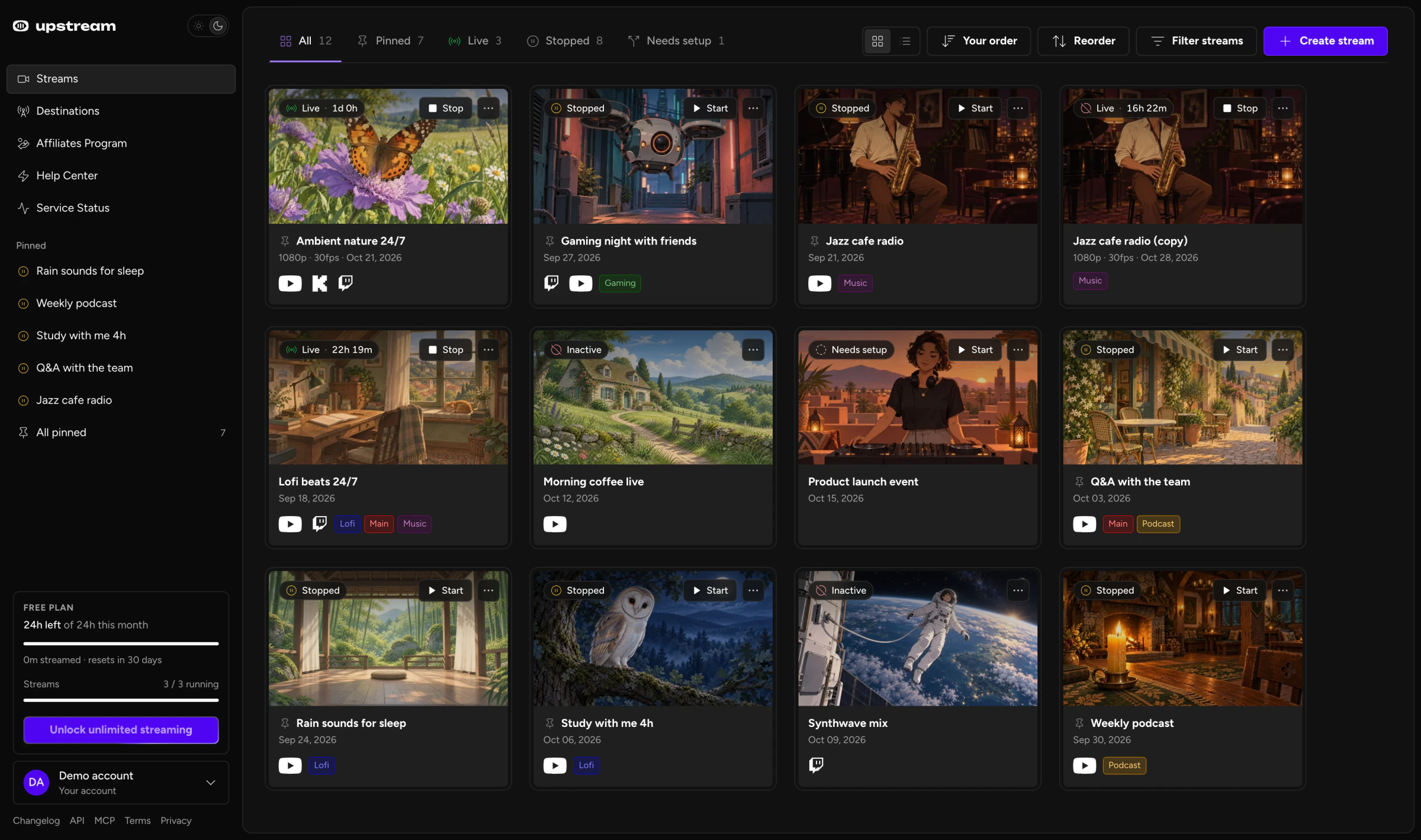
Streams is the app's home page. After the redesign, a card tells you what its stream is doing and keeps the other actions in its menu.
- Dashboard is now called Streams in the menu, the page title and the breadcrumbs. Old
/dashboardlinks still work. - Cards have two action buttons instead of five, with the rest in a ··· menu.
- Tabs with counts: All, Pinned, Live, Scheduled, Stopped and Needs setup.
- Six sort orders, plus a compact list view for long accounts.
- Up to five pinned streams in the sidebar, one click away.
- Duplicate copies a stream's setup in one step.
- Stream settings open in a window, so you stay on the page.
- A near-black dark mode and a neutral grey light mode, with purple kept for accents.
Why do stream cards have fewer buttons?
We wanted cards you can scan at a glance. Most of the old buttons opened a part of the stream you can also reach after you open it. Before this release, a live stream's card showed Watch, Stop (Power when it multistreams), Edit, Studio and Settings. Cards without tags also showed a "No tags" picker.
Twelve live or stopped streams meant 60 of these buttons on one page.
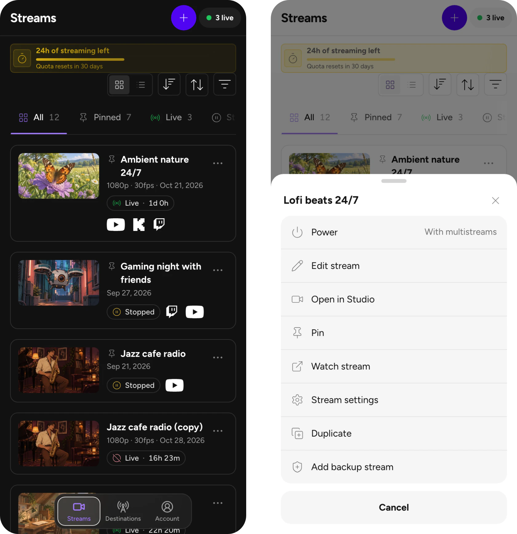
Now the card has two: Start or Stop, and a ··· menu. Click the title or an empty part of the card to open the stream. Studio, settings, pin, watch and duplicate are in the menu, plus backup stream controls on accounts that have them. Try both versions below. We rebuilt both cards from the old and new card code.
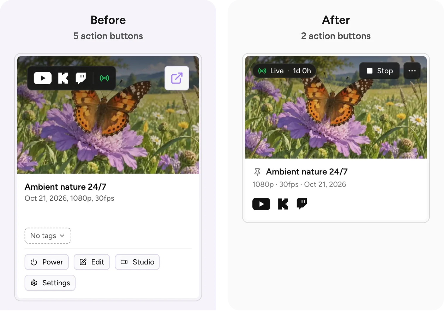
5action buttons on the card
Cards without tags also showed a "No tags" picker. Accounts with backup streams had a sixth button.
Click the title or an empty part of the card to open the stream. Studio, settings, pin, watch and duplicate are in the ··· menu. Hover to add a tag.
On a desktop card that's 5 action buttons down to 2, or 60% fewer. Accounts with backup streams had a sixth button, so they go from 6 to 2. On a phone, the row of Start, Edit, Studio and More became one ··· button that opens the full action sheet: 4 buttons down to 1.
We counted the old buttons in the card's code at the last commit before the release, and the new ones in the rendered page. Only buttons that act on the stream count. The status pill, tags, pin icon and platform links don't count on either side.
Cutting the row back to two follows Hick's law and two of Nielsen Norman Group's usability guidelines:
- Hick's law. The more choices you see, the longer a decision takes. Five buttons on a card means five choices for that stream before you act (Laws of UX).
- Minimalist design. Nielsen Norman Group's eighth usability heuristic: "Interfaces should not contain information that is irrelevant or rarely needed" (NN/g).
- Progressive disclosure. Show the most important options first and offer the rest on request (NN/g). The ··· menu is that second step.
Clutter also slows people down in a way you can measure. MIT researchers found that the time it takes to find a symbol on a map rises with how cluttered the map is (MIT News, on Rosenholtz, Li and Nakano in the Journal of Vision, 2007). Our old grid, twelve cards with five buttons each, was one of those.
On desktop, Start and Stop stay on the card. Going live or stopping a stream should not need a menu.
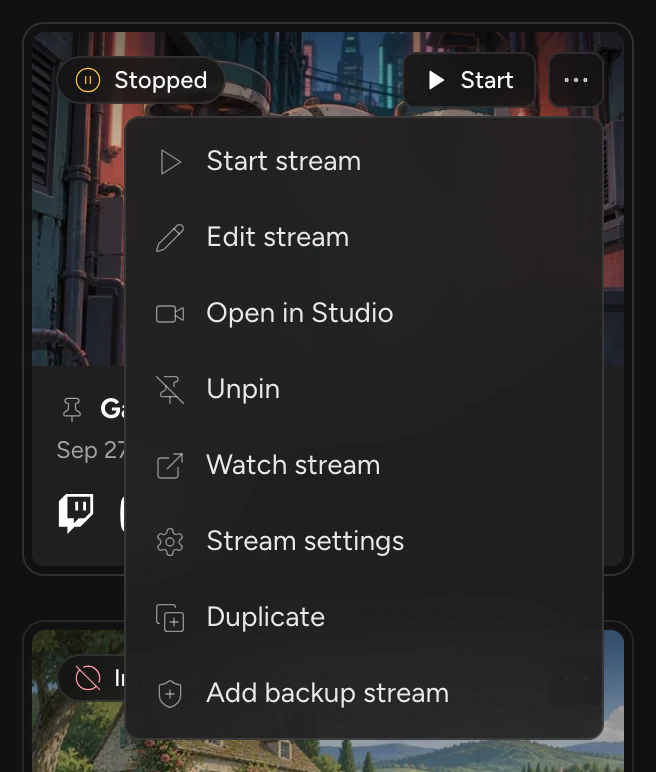
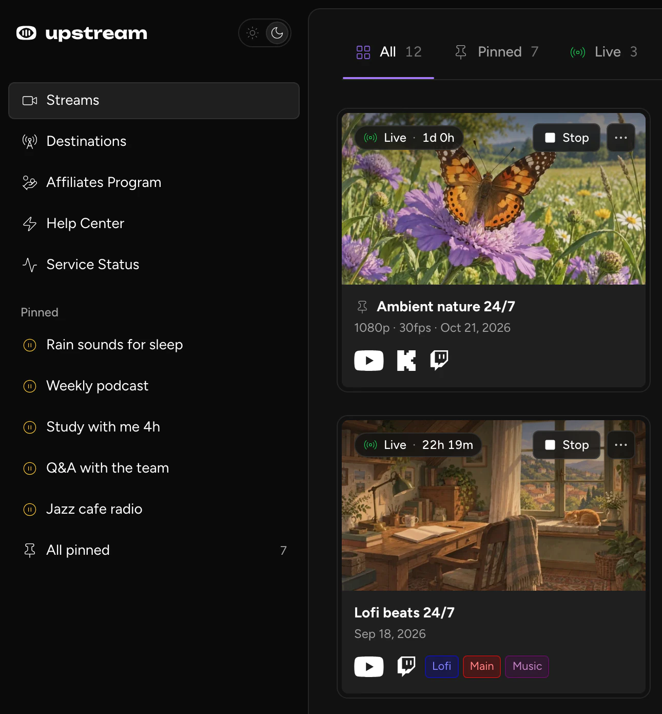
The cards are also flatter. The old card's code used shadow classes 11 times, and the new one uses none. On desktop cards, status lives in one pill on the thumbnail. A live stream's pill shows how long it has been live, and a stream that is starting shows Starting next to a small spinner.
Status tabs, sort and list view
The tabs across the top used to filter by platform. Now they filter by what a stream is doing. You get All, Pinned, Live, Scheduled, Stopped and Needs setup, all with counts. Empty tabs hide, except All and the one you're on. Needs setup collects stopped streams that have no destination yet, so a half-finished stream stays easy to find.

Between the tab counts and the status pill, you get visibility of system status without digging. On desktop, click a card's pill to see how its destinations are doing, for example "2 / 2 streaming".
Platform filters moved into Filter streams, next to search, tags and a Pinned only switch.
Sort has six orders: Your order, Status, Next scheduled, Name, Last changed and Newest. Sorting never rewrites your saved order, and Reorder switches you back to Your order. List view shows one row per stream, which helps once you have more streams than fit on a screen. The page remembers which view you picked.
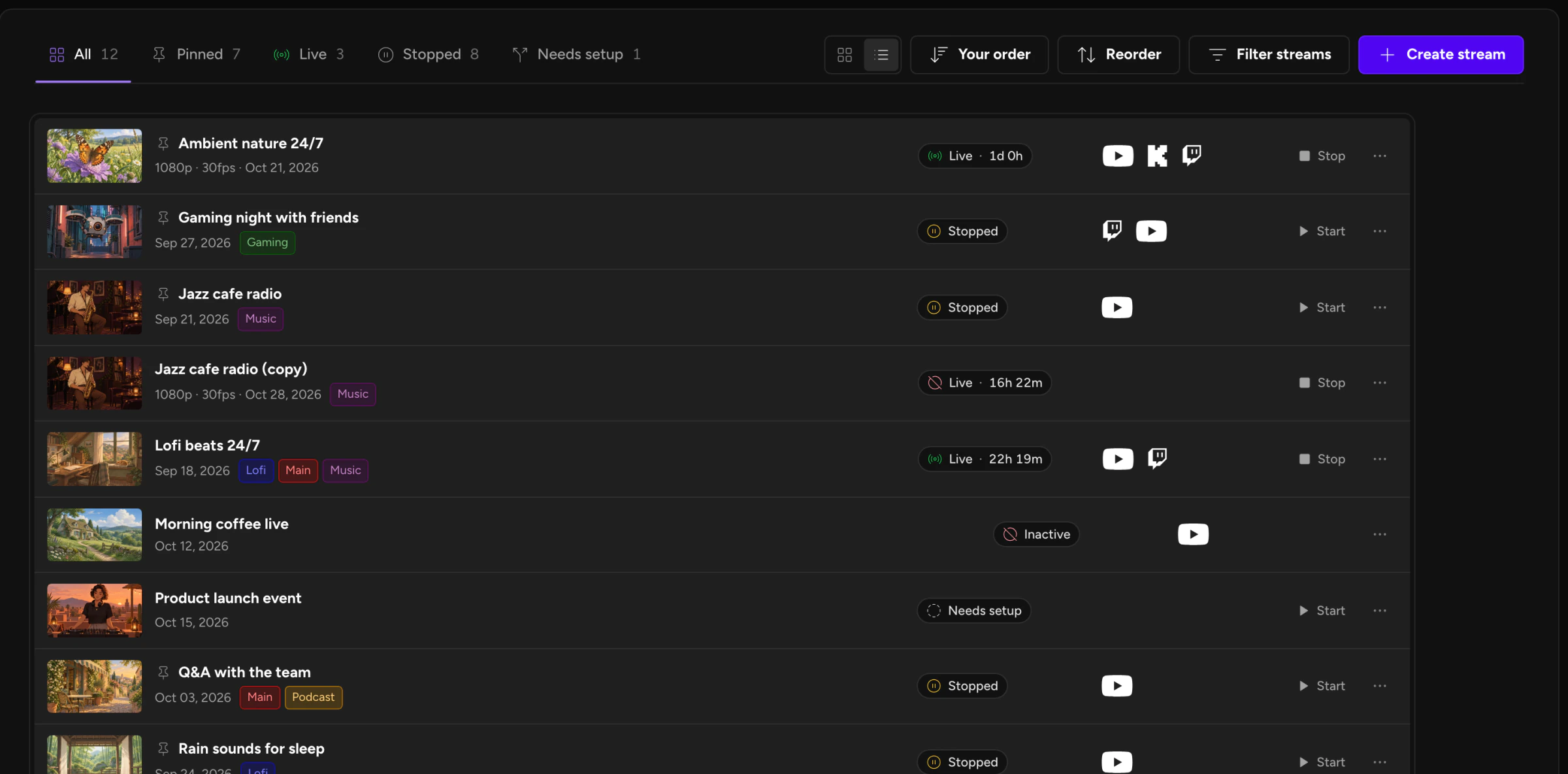
The toolbar did gain two controls: the sort menu and the grid and list switch. We'd rather add two controls once at the top than keep five on all the cards.
How to pin a stream
Open a card's ··· menu and choose Pin. The stream appears under Pinned in the sidebar, with a live or stopped icon next to its name. Click it to open the stream. Try it below.
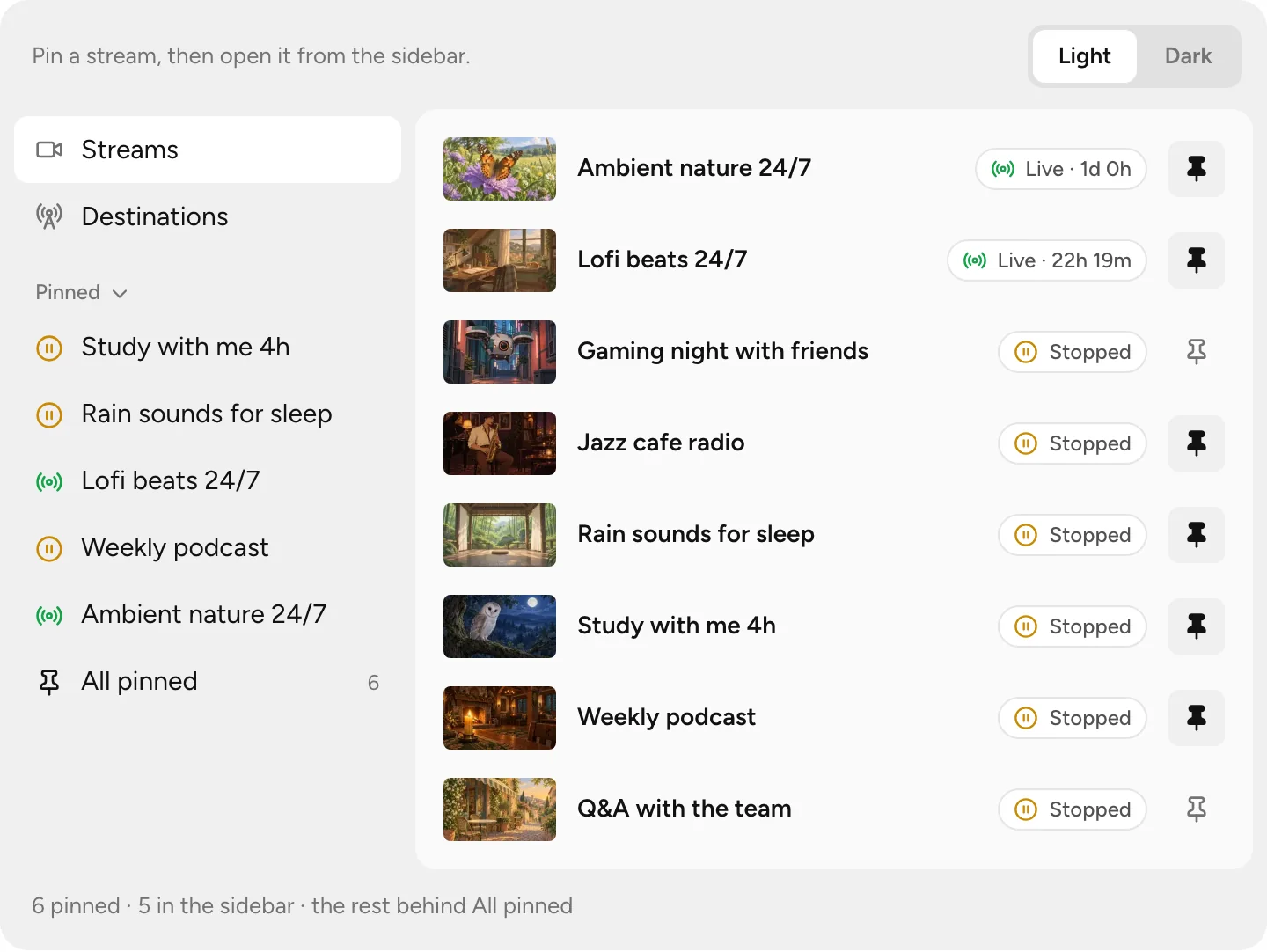
Pin a stream, then open it from the sidebar.
- The five most recent pins show in the sidebar. Past five, an All pinned row shows the total and opens the Pinned tab.
- Pins belong to the person who made them. Teammates who share an account keep their own.
- Phones have a tab bar instead of a sidebar, so there your pins live in the Pinned tab on the Streams page.
- Click the Pinned heading to collapse the section when you don't need it.
From another page, opening a stream you use daily took two clicks: Dashboard, then the card, plus a scroll if it sat further down the grid. A pin keeps it in view, so you don't have to remember where it sits. Your five newest pins are one click away on any page with the sidebar.
Build the stream in the cloud.
Schedule videos, produce browser-based live shows, or send one feed to multiple platforms from the same Upstream workflow.
A darker, flatter dark mode
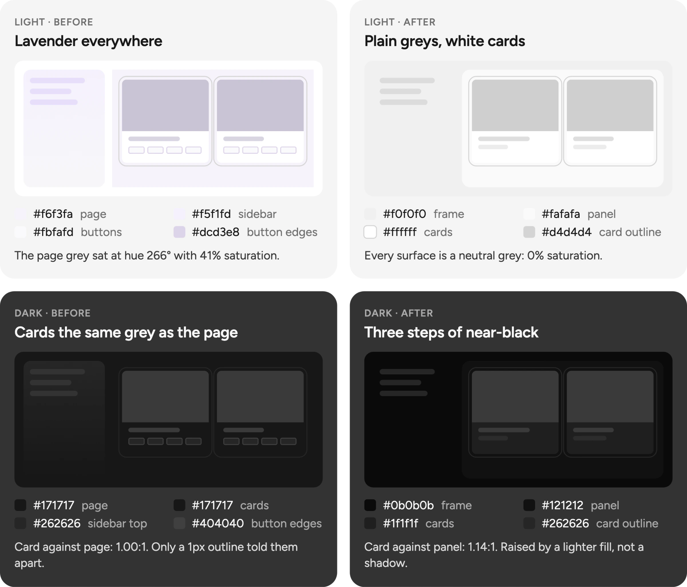
On a desktop, dark mode now has three layers. The frame behind everything is #0b0b0b, the panel that holds the page is #121212, and cards are #1f1f1f. Before, the page and the cards were both #171717. Their contrast ratio was 1.00:1, so a 1px outline had to separate the card from the page.
Now the card is one step lighter than the panel, and the panel is one step lighter than the frame. A card against the panel measures 1.14:1. It reads as raised without a shadow or a glow.
Material Design and Apple both recommend something close:
- Material Design. "The recommended dark theme surface color is #121212." Material also makes raised surfaces lighter. Its 1dp card, 5% white over
#121212, works out to#1e1e1e. Our cards are#1f1f1f(Material Design). - Apple's Human Interface Guidelines. In Dark Mode, Apple uses dimmer base colors for what sits behind and brighter colors for what sits in front (Apple).
Text stays easy to read. White text on the new cards measures 16.5:1, and Material asks dark surfaces to allow at least 15.8:1 with white text. The old sidebar gradient is gone too. The flat frame replaced it.
Light mode without the lavender
Light mode used to be tinted purple. The Streams page sat on #f6f3fa, a lavender with 41% saturation (HSL). Buttons, borders and the sidebar used lavender greys too. Now the frame is #f0f0f0, the panel #fafafa and the cards white. All three are neutral greys with 0% saturation.
In the app's front-end code, the four lavender greys appeared 155 times before today. The Streams release cut that to 7, all in the Stream Designer. The Designer update that went out the same day removed the last ones, so none of the four are left.
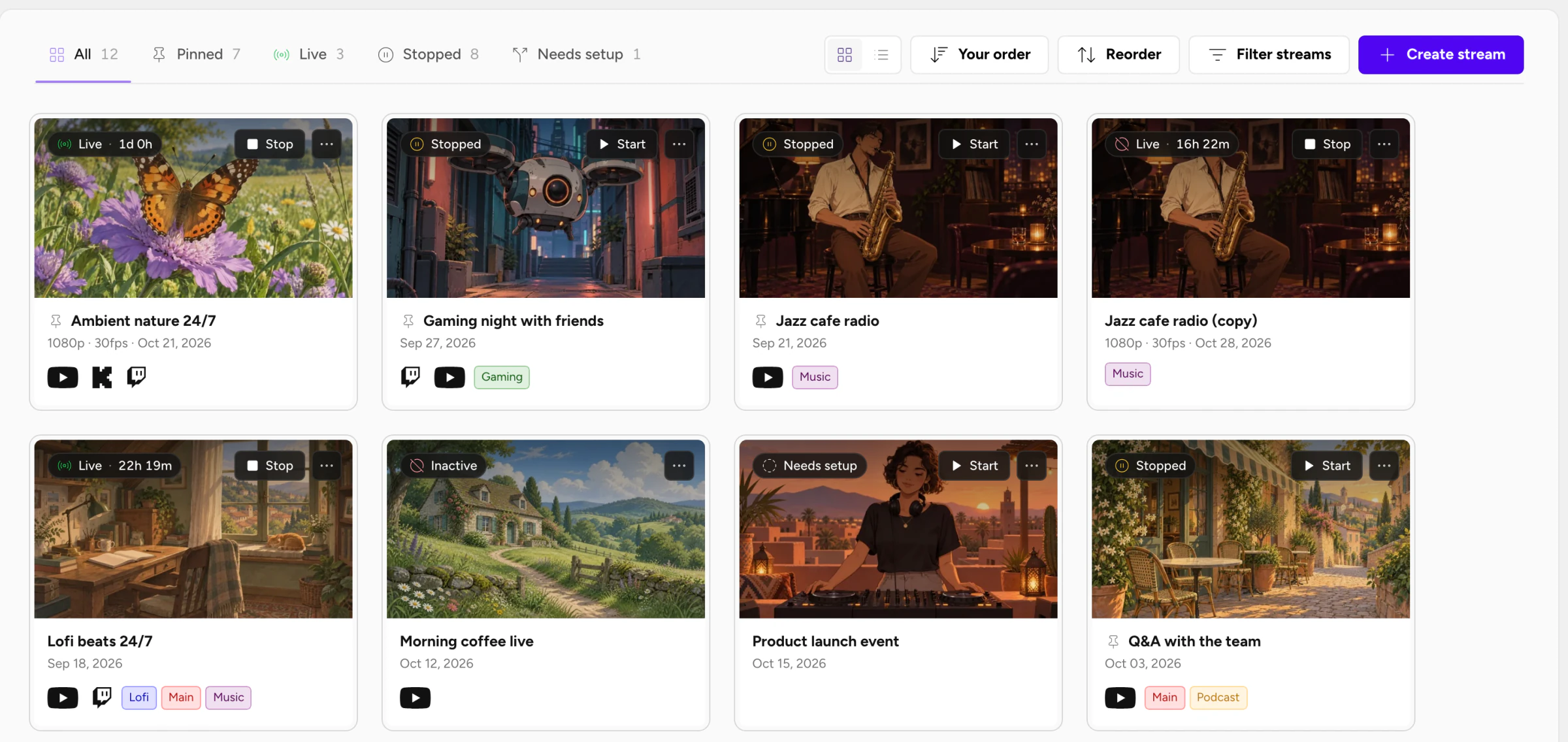
With the tint gone, purple is an accent again. It marks main actions like Create stream, the selected tab and, on the free plan, the upgrade button.
Material's dark theme guidance makes the same point about brand color. Use it at full strength on one or two elements, such as a logo or a button, so they stand out (Material Design).
Light mode got as much work as dark. Nielsen Norman Group's review of the research found that people with normal vision usually do better in light mode, and it recommends letting people switch (NN/g). You'll find the theme switch at the top of the sidebar.
Stream settings open in a window
On desktop, stream settings now open in a window over the page you're on, with the categories on the left. On a phone they fill the screen. You keep your place on the Streams page or in the builder while you change a setting.
If you stream with OBS, the layout will feel familiar, since its Settings window also splits options into sections such as General, Stream, Output, Audio and Video. We matched that because people carry habits over from the tools they already use.
Escape closes the window. To open the full settings page in a new tab, Cmd-click or Ctrl-click the settings link.
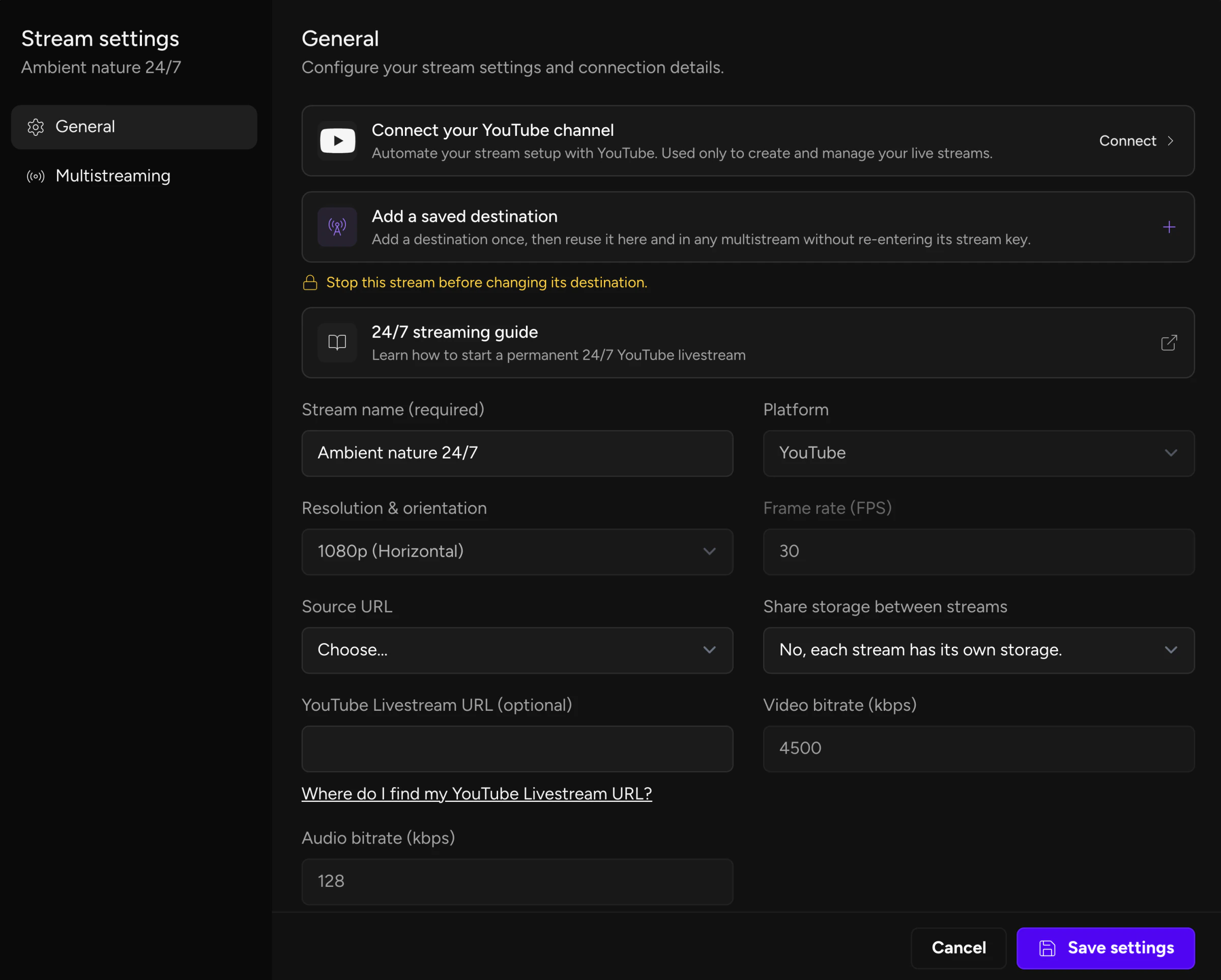
Smaller changes
Account settings are cards. Profile information, password, two-factor and the other sections sit in their own cards, with the heading above them. A boundary around each section makes it read as one group. The purple-tinted shadows behind those cards are gone.
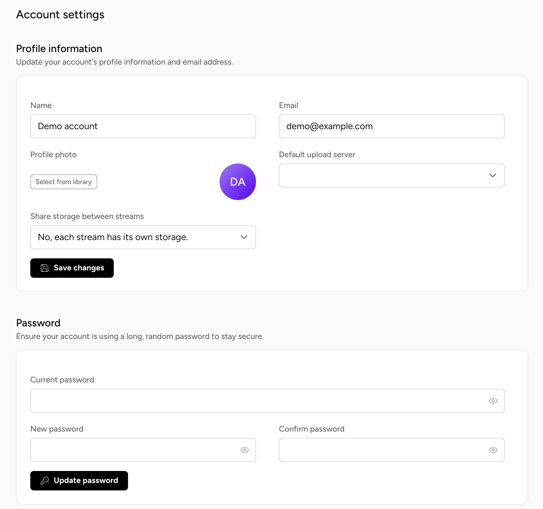
Duplicate. Choose Duplicate in a card's menu to copy a stream's settings, Designer layout, Studio scenes and tags. Destinations are not copied, so you pick them for the new stream. The copy lands in Needs setup, and your plan's saved-stream limit still applies.
Phones. On a phone, a card has one ··· button and the status pill sits under the title. Streams without a thumbnail show a film-icon placeholder, so the rows line up.
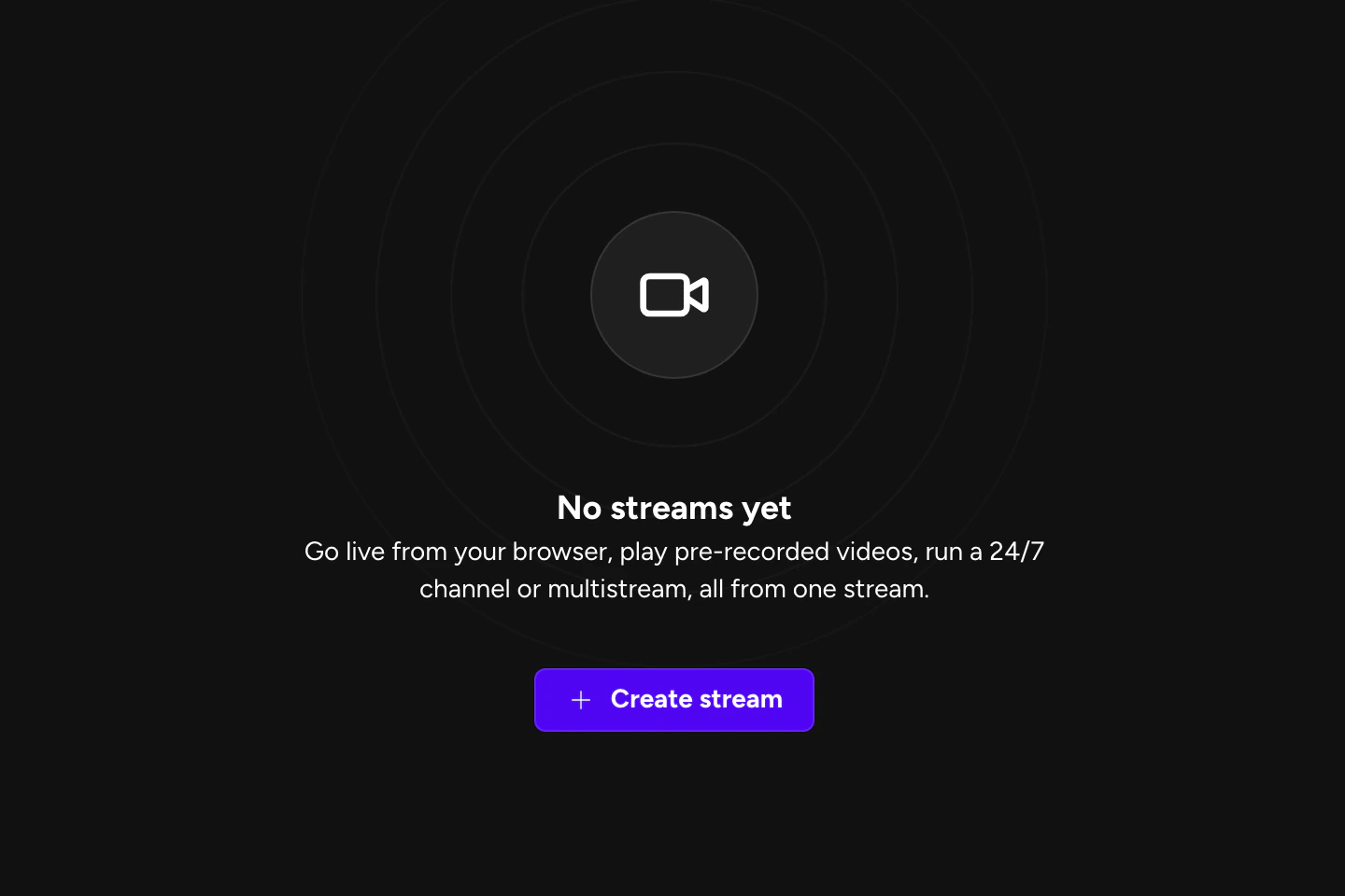
A first step for empty accounts. Nielsen Norman Group's advice for empty states is to "Use Empty States to Provide Direct Pathways for Key Tasks" (NN/g). So with no streams, the Streams page shows a ring empty state with one sentence of copy and a Create stream button. The toolbar stays hidden until there's something to sort. The copy went from 39 words to 23. Destinations and Notifications use the same ring empty state.
Studio shows, 24/7 loops and multistreams side by side
Live Studio shows, 24/7 and scheduled loops and multistreams all use this card, so one Start button and one ··· menu run them. Pin the ones you touch daily and they sit a click away on any page.
You can try the new page on the free plan, which has 24 streaming hours a month at 1080p30.
FAQ
Does this change how my streams run?
No. The changes are to the pages you manage streams from, plus pins and Duplicate. Nothing about how a stream is encoded or sent to platforms changed.
Can I switch back to the old cards?
No. You can pick grid or list view, and light or dark mode. If something you used a lot is harder to reach now, tell us through the help center.
Sources
- Laws of UX, "Hick's Law": https://lawsofux.com/hicks-law/ (accessed 2026-10-29)
- Jakob Nielsen, "10 Usability Heuristics for User Interface Design", Nielsen Norman Group: https://www.nngroup.com/articles/ten-usability-heuristics/ (accessed 2026-10-29)
- Jakob Nielsen, "Progressive Disclosure", Nielsen Norman Group, 2006: https://www.nngroup.com/articles/progressive-disclosure/ (accessed 2026-10-29)
- MIT News, "MIT's clutter detector could cut confusion", 2007, on Rosenholtz, Li and Nakano, "Measuring visual clutter", Journal of Vision: https://news.mit.edu/2007/mits-clutter-detector-could-cut-confusion (accessed 2026-10-29)
- Material Design 2, "Dark theme": https://m2.material.io/design/color/dark-theme.html (accessed 2026-10-29)
- Apple Human Interface Guidelines, "Dark Mode": https://developer.apple.com/design/human-interface-guidelines/dark-mode (accessed 2026-10-29)
- Raluca Budiu, "Dark Mode vs. Light Mode: Which Is Better?", Nielsen Norman Group, 2020: https://www.nngroup.com/articles/dark-mode/ (accessed 2026-10-29)
- OBS Project, "OBS Studio Overview": https://obsproject.com/kb/obs-studio-overview (accessed 2026-10-29)
- Laws of UX, "Jakob's Law": https://lawsofux.com/jakobs-law/ (accessed 2026-10-29)
- Aurora Harley, "The Principle of Common Region: Containers Create Groupings", Nielsen Norman Group, 2020: https://www.nngroup.com/articles/common-region/ (accessed 2026-10-29)
- Kate Kaplan, "Designing Empty States in Complex Applications: 3 Guidelines", Nielsen Norman Group, 2021: https://www.nngroup.com/articles/empty-state-interface-design/ (accessed 2026-10-29)